This article describes how you can customise the pagination bars that appear at the top and/or the bottom of the thumbnail pages – i.e. search results and galleries. There are several examples that you can load into the code editor to use as a starting point. Note that if you use custom pagination templates, then several backoffice settings with regards to the pagination bars will have no effect, because you can fully control the bars with your own code.
Before you begin
Please understand that there may be no need to make custom templates depending on what you want to achieve. A lot can be done by chosing settings in back office and or changing the CSS, adding Javascript and so on. Custom templates offer more freedom and may result in better performance, but there is no guarantee that future XS updates will not interfere with your custom templates. If you do not accept this, then do not make custom templates.
Make sure that you understand how the XS tags work, before changing the templates described here. You can find more information in the article Infradox XS functions, tags and conditions.
You also need to know about constants, locales and repository properties before you start working on the thumbnail templates.
The top pagination bar
In this paragraph you’ll learn how to change the top pagination bar. You can customize the template for the bottom pagination bar as well.
In the code editor, select template 120 – Top bar, then click “Load example”, select “paginationbar-input-1.txt” and click the Use code button. This template is more or less the default XS template for the top pagination bar. It has the following elements:
- An unordered list (ul, li) for number of thumbnails per page (see below screen shot).
- A section with a previous page button, an input box to change page, and a next page button
- A checkbox to enable/disable mouse-overs displaying larger thumbnails
- A section for buttons to e.g. change the page layout, to add files to the lightbox, to the cart, and buttons for social media.
Note that the template has a number of conditional fragments because the same pagination bar is used on different types of pages. The conditional fragments are used to show or hide elements based on the active page (e.g. different buttons when displayed on the shared lightbox page), and to hide or show elements depending on the user’s session (logged in or not).
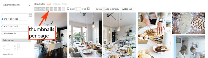
Screen shot showing the result after loading and enabling example code
Displaying thumbnails per page in a drop down box
To change the “thumbnails per page” section (see above screen shot) to a drop down, find the following code in the editor:
and replace it with:
In the below screen shot you can see how this will look. The screen shot also shows other changes that are described next.
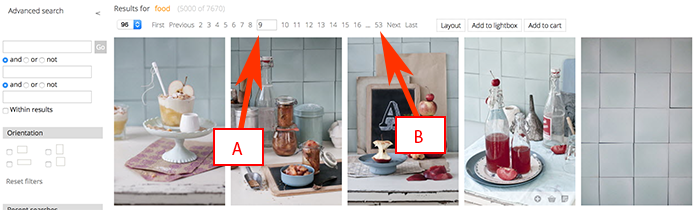
Displaying page numbers as links
As you can see in the above screen shot, the page numbers are displayed as links as opposed to an input box with previous and next buttons (in the first screen shot).
The page links can still have an input box allowing one to directly enter a page number (see A). You can achieve this with the following code:
The above tag outputs the page numbers as links. In this example, it uses the following parameters:
- The first parameter is set to 15, this is the number of links to display. In this case (15) it will display 7 links in front of the current page and 7 links after the current page. You can change this parameter as required but it is best to use an uneven number.
- The second parameter is set to 1, this will display an input box in the position of the current page number where the user can enter a number to directly jump to a page (see A in the above screen shot). If you don’t want to display the input box then change this parameter to 0. The current page number will then be displayed as a normal list item, its class will be “currentpage” so that you can style it separately.
- The third parameter is set to 1 to include the last page number with leading dots (see B in the above screen shot). If you don’t want this, then change its value to 0.
The buttons for First, Previous, Next and Last are added to the template as follows:
Note that the container unordered list (UL) has the class paginationwithnumbers. This class is defined in the standard CSS and it takes care of how the list is styled. You can of course override the standard CSS as required. The above example uses constants to output the labels for the buttons (e.g. First, Previous et cetera). You can remove these buttons if you don’t want them, or you can replace the labels with icons and so on.
Using buttons for page layout options
The standard templates display a Layout button in the pagination bars. Clicking the button will display a menu with page layout options. The options available (i.e. grid, list, small, large and flow) are configured in back office. You can however use buttons or a drop down menu instead.
Also note that you can change the look and behavior of the default layout dialog with the xsthumbs Javascript object. This is described in the article: Working with the Infradox script library.
If you want to display buttons for each option – instead of the standard Layout button, then you can use the following HTML in your custom pagination templates:
Note that the HTML for the Page layout button (with id #pagelayout) must not be in your template, because it takes precedence.
You can style the list elements anyway you want and you can of course remove options that you don’t want to use.
The active option automatically gets the class “active”. Here’s an example of the CSS that you need to add to style the buttons:
Alternatively, you can use a drop down menu (select element) for the page layout options. Use the following HTML for this:
The bottom pagination bar
Underneath the thumbnails, a second pagination bar is displayed with pagination elements. Note that you can disable the bottom toolbar via Site configuration, Page Layout (setting Bottom toolbar). You can create a custom template for the bottom toolbar as well, and you can use the same elements as described above. If you don’t want a bottom pagination bar, then you can either disable it as described in this paragraph, or you can save template 121 (bottom bar) without any HTML or code in it.
Bottom pagination bar for the Biography style gallery
All templates use the top- and bottom pagination bars, with the exception of the template that is used for the Biography style galleries. If you use this template, then you can customize the pagination bar by editing template 122.
How to use pagination bars in your custom templates
To add pagination bars to e.g. a custom gallery page, use the html() tag to include the HTML. If you didn’t create custom pagination bar templates, then this will insert the default HTML. Otherwise this will automatically use the custom template(s).
To insert the top pagination bar (intended to be displayed above the thumbnails):
To insert the bottom pagination bar (intended to be displayed underneath the thumbnails):