This article describes how you can build custom thumbnail templates for search results, galleries, lightboxes and so on. There are five different viewing styles that you can configure via Site configuration, Thumbnail pages. The modal lightbox page uses a grid type thumbnail. The code editor provides code examples for each of the styles (grid, list, small, large and flow), and for the modal lightbox thumbnails – that you can use as a starting point. If you load the first example code for one of the thumbnail templates and save it without making changes, then the client facing result is the standard result (i.e. what you get without customized thumbnail templates).
There is also example code that you can use if you have configured your pages to use Google Icons instead of button images.
Note that you can change just one or a few viewing style templates. You don’t have to make a custom template for every viewing style if for instance you just want to change the large thumbnail template.
Before you begin
Recommended reading: Thumbnail hover text macro, Using the code editor, Infradox XS customisation.
Depending on what you want to achieve, there may be no need to make custom thumbnail templates. A lot can be done by chosing settings in back office and/or changing the CSS, adding Javascript and so on. Custom templates offer more flexibility and may result in better performance (by removing what you don’t need), but the caveat is that future XS updates may interfere with your custom templates. I.e. you may have to make changes to your custom templates as a result of a version update.
Make sure that you understand how the XS tags work, before changing the templates described here. You can find more information in the article Infradox XS functions, tags and conditions. You also need to know about constants, locales and repository properties before you start working on the thumbnail templates.
Configuring related settings
It is recommended that you start configuring the thumbnail pages before you use the code editor to make template changes – because the settings will also affect your custom templates. Note that the default templates are complex and use several classes so that everything can be configured with back office settings without making code changes. If however you are going to make code changes, then the code can be simplified (and as a result smaller and faster) by removing classes and/or HTML you don’t need for your specific requirements.
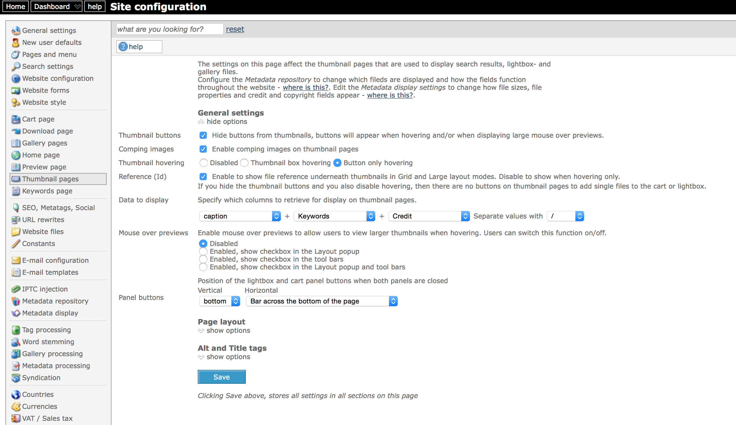
The above screenshot shows where you can configure the thumbnail templates in backoffice
Site configuration, Thumbnail pages
- Click on General settings and configure the Data to display setting. This is used with the tag
- Configure the settings for hovering and so on as needed. Note that the options that are best used depend entirely on what you want to achieve with your custom templates. Create a support ticket if you need advice.
- Open the section Page layout and enable the thumbnail viewing styles that you want to make available on the client facing pages (i.e. grid, list, mini/small, large, flow).
- Open the Alt and Title tags section and configure the alt and title tags. These are used in the templates with
. Note that these are important for several reasons, one of them being SEO.
Site configuration, Metadata display
- Click on General settings and configure what info (i.e. rights, restrictions and so on) you want to use in the thumbnail templates.
You can use these settings in the templates, e.g. withwhich outputs 1 if “rights info” is configured to show on thumbnails.
Google icons
If you decide to use Google icons, then make sure to set this up first. You can then use the example templates that are ready for Google Icons as a starting point. In Site configuration, go to Website style and open the Button images section. If you haven’t changed the settings before, then you’ll see the default Google icon names already filled in. Select the Google icons option and save your settings. You can of course specify different icon names and codes but this is beyond the scope of this article. You can find more information here. Note that the icon names are followed by a colon (:) and a code. The code is used for older browsers, specifically MSIE 9 and lower.
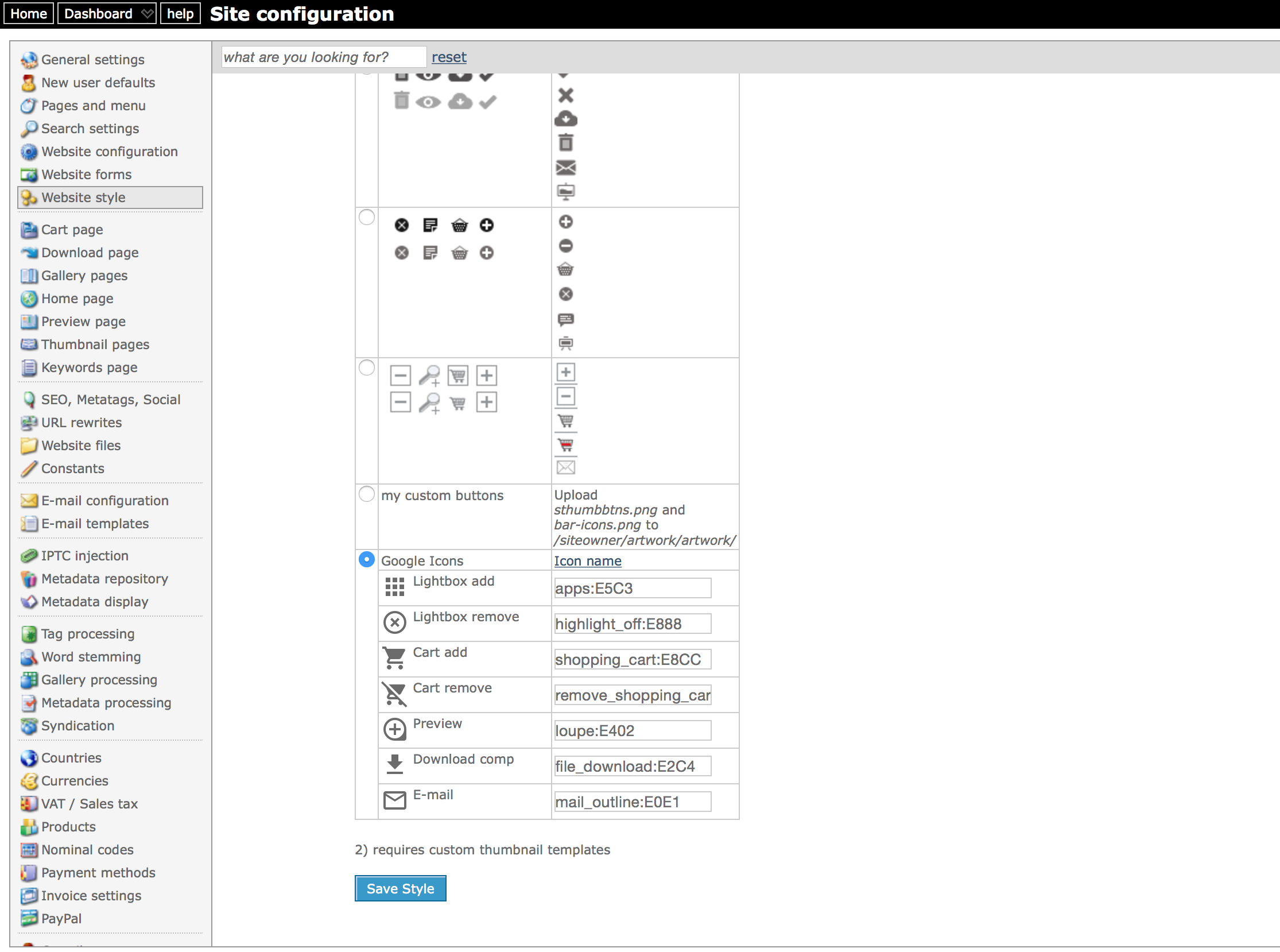
The above screenshot shows the set up for Google Icons
The Grid template explained
This paragraph explains how the grid thumbnail template works and how it can be changed. The other templates are more or less the same, and you should be able to work on those once you have successfully changed the Grid template.
Note that the classes and attributes (set with tags) are important because the script “looks for” elements having – or not having – certain class names and or attribute values.
In the code editor, select Grid (90) in the dropdown box at the top. Then click “Load example” and load the default code into the editor.
The first line looks like this:
The HTML output of this line may look something like this:
The tags used in this code are:
The second line:
uses the ‘mediatype’ tag. This will output 0 for images, 1 for video, other numbers for other media types. If your website uses only images, then this line can be removed, otherwise it should be there because it’s used to position video players and icons.
Important: starting with version 30, the above div (with class “vicon”) must be moved inside the div with the class “thumbnail”. E.g.
The following div is the container of the thumbnail:
It uses the following important tags:
The next div in the template holds html that either displays when hovering only or always – depending on what you have configured in back office.
The above tag outputs 0 or 1, depending on what you have configured with regards to hovering. So the output will look like either
The above div contains elements for thumbnail buttons, file id’s, restriction info and so on – which is explained below.
The flow template
The flow template uses the tag flowwidth. It outputs HTML required for the thumbnails based on settings you have configured in Back office:
As you can see this tag outputs the complete HTML, have a look at the template below to see how the tag is used:
Constants
Like all other templates, constants are used to output text depending on the active locale (language). Even if you don’t need support for multiple user interface languages, it is still recommended to use constants because it allows you to manage texts in a central place. Simply change the value for a constant and it will be changed everywhere automatically. To find out more about managing constants, read the article: Website constants.
The constants used in the thumbnail templates can have a 3rd parameter, e.g.
This 3rd parameter can only be used in thumbnail templates. It tells the parser to replace the constant with data from the repository. It is best to keep these tags as they are in the example code.
The above line uses the tag
to output either fileid0 or fileid1 as CSS class name. Class name fileid0 is then used to hide the element (in this case a list item).
Restriction icons
To display the restriction icons, the following logic is used:
The HTML output may look something like this for an RF file:
The above tag outputs 1 if you have configured “Rights info” to display on thumbnail pages (Site configuration, Metadata display, General settings).
XS uses CSS and Script to hide or show elements based on the HTML output, e.g. rmrf1 to display the info, rmrf0 to hide it.
If for example, you decide not to use these settings because you always want it to show – then you can replace the tag with a hard coded value. E.g.:
In the above example, style=”display:none” has been removed and the class rmrf1 is hard coded.
The tag above outputs the value for the field that you have configured as the field that has the file ids. This can be configured via Website Configuration in back office.
You may have to remove most of the standard HTML if you need to implement a thumbnail template that is completely different. This is possible too.
The grid thumbnail template used for the modal lightbox
The modal lightbox uses a grid type layout for the thumbnails by default. You can create a custom version for this template too. To do this, select “Modal lightbox (100)” in the Code editor drop down. Then load the example template into the editor with the “load example” button at the top.
The template is mostly the same as the normal grid styke template, but it has a few different classes and it uses tags that may be used in this template only. These are:
Outputs 1 if the the lightbox is opened when on the cart page.
Outputs the URL to the preview page (or modal preview).
An overview of all the slot tags that you need to understand
Tags for rights / restrictions
Tags for thumbnail files
The html and code for the thumbnail buttons
If you have configured thumbnail icons to use images (not Google icons) then the buttons HTML will look like lines below. The CSS has background images configured.
If you use Google icons, then the buttons HTML needs to be changed (there’s a ready made example available to load into the code editor). Note that the links (<a>) have the class material-icons. And the link text is the icon code between square brackets. E.g. [cadd] for the add-to-cart icon. The icon codes are:
- [ladd] add to lightbox
- [lremove] remove from lightbox
- [cadd] add to cart
- [cremove] remove from cart
- [preview] preview
- [comp] download comp image
- [email] e-mail image
Examples
Example 1 – how to display the RF / RM icons
This example explains how you can display an icon to indicate that a file is RM or RF at all times while having hovering enabled.
1) Load the custom CSS into the code editor
2) Add the following CSS:
This is the place holder div element in which the icon will be positioned. The div will be added underneath the thumbnail box later. In this example, it has a top margin of minus 15px to move it up. Note that what the CSS should look like for your particular situation depends of course on how you have configured the thumbnail templates and CSS. The above CSS is just an example.
3) Load the “Large” thumbnail template into the code editor
4) Underneath the div with the class “thumbnail” add the following code:
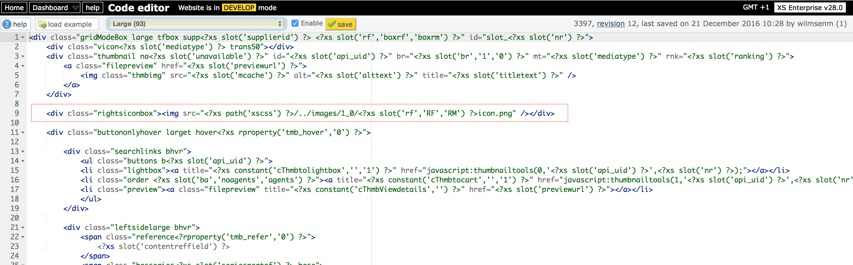
The red box in the above screen shot shows where you need to add the html
The above tag outputs the relative path to the css folder. You need to go up one folder and then to the images/1_0 folder. Hence the .. in the html.
The above will output RF for RF files, or else RM. Therefore, the example below will output either RFicon.png or RMicon.png
You can of course use your own icons instead. Upload your images via Site configuration, Website files, Website artwork. You will then need to change the path accordingly.
For example:
5) Change the other thumbnail templates as required.