Infradox XS has a number of Widgets that you can use when you are creating custom pages – e.g. a custom home page. XS Widgets are small code snippets that you can use to display RSS feeds, random photos, slideshows, gallery photos, editable text blocks , HTML and so on.
The Infradox widgets are relatively simple to use. All the necessary script and CSS is automatically included, and the way the widgets function can be configured with parameters. It is also possible to retrieve and display data without widgets, in which case you’ll have to write your own CSS, HTML and in some cases Javascript.
Please read the articles about Using the code editor and about Infradox XS customisation first.
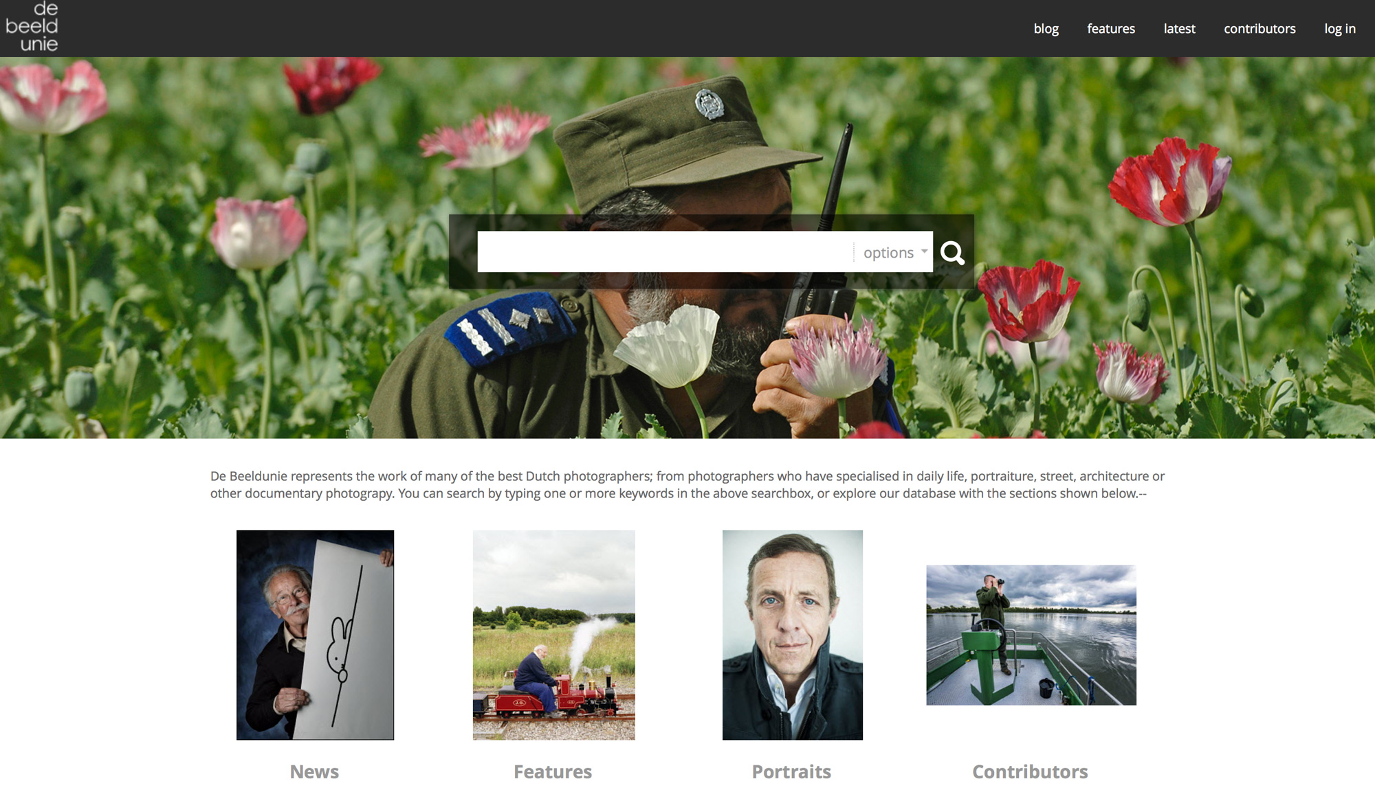
The screenshot shows a home page using the Slideshow, Quick Search and Gallery thumbnail widgets.
In this article you’ll find information about the following XS Widgets:
- Social widget – buttons for sharing / liking
- Quick Search widget – for search function
- Photo widget – to display random photos
- Slideshow widget – to display slideshows e.g. on a custom home page
- Listfiles widget – to list files in a specified folder
- Gallery thumbnail widget – displaying random thumbnails from galleries
- Latest thumbnails widget – displaying thumbnails for the latest uploads
- Gallery Matrix widget – displays a grid of thumbnails for your galleries
- Gallery carousel widget – to add a scrolling bar with thumbnails for galleries
- Login box widget – to display a login box on a page
- RSS feed widget – to enable RSS feeds
- Feature page widgets – for use on gallery pages using the custom features layout
- Contributor page widgets – for use on contributor profile pages
- Following widget – for use on the “Following” page
Social media sharing & liking
Facebookapibuttons widget
Change the style parameter to 1 if you want a Like button only, to 2 if you want a Like and Share button and to 3 if you want a Share button only.
How the buttons appears is configured with the layout parameter (in the example we use button_count). Have a look here https://developers.facebook.com/docs/plugins/share-button and here https://developers.facebook.com/docs/plugins/like-button for possible options.
Socialbuttons widget
For more info, read the article about Setting up the contributor pages.
Quick search widget
If you create your own page header and menu, then you can use the quicksearch widget.
Photo widget
You can use the Infradox Photo Widget to display a photo (or to output the path to a photo) that you have uploaded with the file manager (Site Configuration, Website files, section Photo widget files).
To output just the path to a file – e.g. to use a photo as a background image in your HTML – use the parameter pathonly:1. The other parameters will then be ignored with the exception of the stl parameter. For example:
To output an image or images (not just the path) use for example:
The parameters are within the { and } and are used to achieve the following (the parameters txtid and class are optional):
Width and Height
w – the width of the photo, leave 0 to display the photo at its actual width
h – the height of the photo, leave 0 to display the photo at its actual height
If you only specify the width, then the photo will be displayed at the width specified and the height will be adjusted automatically and proportionally. If you only specify the height, then the photo will be displayed at the height specified and its with will be adjusted accordingly. For example {w:300,h:0} will display the photo 300 pixels wide. Note that you should not upload large photos if you only want to display the photos at a small size because this will have an impact on page load times.
class
To add a class name to the image, use the optional parameter class. E.g. the above example may output something like this:
Style
The stl parameter is used to configure the operating style, e.g. stl:0
0 – selects a random photo from the files that you have uploaded
1 – selects a photo of which the name starts with the day of the week number followed by a dash. Sunday is the first day of the week, e.g. 1-somefile.jpg for Sunday, 2-anotherfile.jpg for Monday and so on. You can use this to display a different photo every day of the week. If a photo for day x is not found, then the first photo will display.
2 – selects a photo of which the name starts with the day of the month number followed by a dash, e.g. 1-jan.jpg for the 1st of January, 2-jan.jpg for the 2nd and so on. You can use this to display a different photo every day of the month. If a photo for day x is not found, then the first photo will display.
3 – selects a photo based on the week number. Photo names must start with a number followed by a dash. E.g. 1-somephoto.jpg for week 1.
Using XML files for the photo widget
You can upload XML files if you want to display text for a photo and/or if you want to specify a target URL so that the user can click the photo to go to a certain page. The XML file must have the same name as the jpg file (photo) but with the extension .xml.
This is an optional feature, you can use the widget to simply display a photo without using XML files.
Below is an example XML file.
Attaching a URL to a photo
If your XML file has the tag
Example URL’s:
- /latest (to go to the page with the latest uploads)
- /search?s=boat (to search for the keyword “boat”)
- /contributor/107/john-beatle.html (to go to the profile page of contributor John Beatle)
- /gallery/stories/1314/1339/576/1/central-african-republic.html (to load a specific gallery)
Also read the notes below for some further information about the URL’s.
Displaying text
If you want to display text that accompanies the photo, then add the locale tags to your XML file. Always make sure to add the tag locale1, other locales are optional. For instance:
The widget will take care of adding the text on the page. To achieve this, add an element to the page (usually a div) and give it a unique id. For instance the id “photowidgettext“, but the id can be anything. Then make sure to add that id to the widget parameters, for instance:
Note that the value for the txtid parameter must be between quotes.
Using HTML in your text
It is possible to use HTML formatting in your text, but XML doesn’t allow for regular HTML formatting. You can however replace all problem characters with HTML codes.
E.g. use < for < and use > for >. E.g. to display text in bold <b> must be written as <b>
You can find more information about HTML entities that you’ll have to convert for use in your XML here.
Some final notes
- To prevent page load time problems, do not use too many files. No more than 31 files is recommended.
- To prevent page load time problems, do not upload files that are larger than the size that you want to display.
- If you upload new files, it’s best to use different file names so that users won’t still see old files with the same name already in their browser’s cache.
- If you want to use the XML feature, then make sure that the XML is well formed and that it doesn’t have invalid characters.
- You can simply copy the URL from your browser’s address bar for a page that you want to display when a photo is clicked. Remove your website address from the URL. E.g. www.mywebsite.com/about-us should be in the XML as /about-us
Slideshow widget
To display a slide show on your custom page, you can use the slideshow tag. The tag must be inside a div with the id “mainimagelist” and the class “nivoSlider” as shown below.
The slideshow widget requires the parameters {w:900,h:450,speed:3000,transition:0,manual:0,stl:2,opt:{ic:0}}, which are explained below.
w – the width of the slideshow images
h – the height of the slideshow images
speed – the transition speed in milliseconds (e.g. 3000 is 3 seconds)
transition – there are several transitions available, use 0 for a cross fade, 1 for slide right, 2 for slide left
manual – use 0 for an automatic slideshow or 1 if the user must click an image for the next one
stl – this is the style parameter, you can use the value 1 or 2:
1 – uses a script for a standard slide show with many transition options, images are cut off if larger than the specified parameters
2 – uses a script that will stretch the image to fit its parent container
opt – the opt parameter value must look like this {ic:0}
the ic parameter is used to specify what happens if one clicks on a slide show image:
0 – disable image clicks
1 – executes a search using the name of the image (e.g. if the image is called bears.jpg, clicking it will search for bears)
2 – go to url, this is explained in detail on the Home page settings page in backoffice.
namefilter – you can use this parameter to include only images with filenames that start with namefilter. E.g namefilter:’abc_’ will load only images that start with abc_ – so abc_myphoto.jpg will load, xyz_myphoto.jpg will not load. You can use this parameter if you want to use the slideshow of different pages with specific images for each of those pages.
subdomainfilter – include this parameter with the value 1 (subdomainfilter:1) to load only images with names that start with the active subdomain id. So if the subdomain with id 3 is active, only images will load if the names start with 3. E.g. 3_test1.jpg and 3_test2.jpg will load.
Note that if no subdomain is active, the id will be 0. So to display slideshow images when no subdomain is active (or actually the subdomain www) you must upload files with names that start with 0.
You can also use the “listfiles” widget, for example to build a CSS only slideshow.
Listfiles widget
The path is used to specify the folder – slide show files are uploaded to the folder ‘home\slideshow’.
The embed parameter is used to define the output for each file listed. This parameter can not have the following characters: = < > : { } ‘ ” and space. You can use HTML entities instead. For a space however, use: [space].
Gallery thumbnail widget
The gallery thumbnail widget displays a random thumbnail from a gallery that you specify. You’ll have to add CSS to style its appearance and you can use small or large size thumbnails. You can attach a URL to the thumbnail so that the user will be taken to a page of your choice when he/she clicks the thumbnail image. You can use the thumbnail widget multiple times on a single page.
Example:
Use
Parameters
galleryid – the id of the gallery from which you want to display thumbnails. Use the gallery manager to find out the id by hovering over the gallery titles.
containerid – this is the id of the element on your page where the HTML will be inserted.
thumbsize – 0 for normal size thumbnails, 1 for large thumbnails
backgroundimg – 0 to create normal HTML or 1 to make the image a background property of the element you have specified with the parameter “containerid”
class – the class name to use for the HTML element that will be created. You can style the element with your CSS.
url – the URL that will be executed if the user clicks the thumbnail (or actually its container). The URL can be anything. In the above example, clicking the thumbnail will search for the keyword portrait.
CSS example
If you want to display a large thumbnail as a background image on the #explorepage, you can use the settings thumbsize:1 and backgroundimg:1 and the class thumbimg
Then, use the following CSS
Latest thumbnails widget
The latest thumbnails widget works in a similar fashion as the gallerythumbnail widget (above). You can use it to display the thumbnails for the last uploaded file or files. The widget can be used to retrieve json data so that the widget can select and paint a random thumbnail within a container, or it can output one or more thumbnails as an HTML list, in which case the widget tag must be placed inside <ul></ul> tags. You can then style the list items with your own CSS.
Parameters
htmllist – 0 to load the data as json and to let the widget script pick a random thumbnail. Also see max. If the parameter value is 1, then the widget will output an HTML list instead and it will list all max thumbnails.
supplierid – 0 for files regardless of their supplier, or the id of a specific supplier. If you use this widget on the contributor profile page, then you can use the literal value “contributorid”. E.g. supplier:”contributorid”. The widget will then load the latest thumbnails for the contributor who’s page you’re viewing. If you use the widget on other pages, then the value for the supplierid parameter must be either 0 or a supplier id (integer value).
max – the maximum number of files (can not be more than 100) to load. If you
containerid – this is the id of the container element. The containing element must be a UL element if you use htmllist:1
thumbsize – 0 for the smaller thumbnails, 1 for large thumbnails
backgroundimg – 0 to display the images as normal elements or 1 to display the images as background images.
class – this is the class that is assigned to the element if you use htmllist:0. If you use htmllist:1 then this parameter is ignored.
url – any url that will load if you click a thumbnail. If the value for url is “preview”, then the preview page for the image will load if you click a thumbnail.
Example 1, display a single random thumbnail
This example will retrieve the data for the last 5 files and it create a DIV element with the class name “thumbimg” inside the container “pthumb0”. The image is randomly picked. If you always want to display the last uploaded file, then use the value 1 for the max parameter (max:1). Clicking the thumbnail will load the latest images page.
Example 2, display the 5 last files as a HTML list
This example will generate a HTML list and each of the list items will have a background image with the large thumbnail. Clicking an image will load the image preview page. You’ll need to style the list items with your CSS.
Example 3, display the 3 last files of a contributor’s uploads as a HTML list on the contributor profile page
Gallery matrix widget
The gallery matrix will display galleries or gallery groups in a grid with your specifications. You can display galleries/groups from selected root levels only, selected/specific galleries only or from any gallery root level.
The gallerymatrix widget must be inside a div with the class “gallerymatrixbox”.
The widget takes the following (required) parameters
{ena:4,rows:1,cols:3,rootid:0,groupid:0,src:0,grp:0,dataorder:0,random:0,spc:5,margin:{top:0,left:0},opt:{b:1,q:0,t:0,s:0,f:0,tm:0},txt:0,tw:0}
ena –
1 left aligned
2 centered
3 right aligned
4 fill space (automatic spacing between thumbnails)
5 ignore all styling parameters so that you can use your own css
rows – the number of rows to display
cols – the number of columns to display
rootid – specify a root id to only take galleries that exist within this root level or 0 if you want to use the src parameter (below)
groupid – specify a group id to only take galleries that exist within this group or 0 if you want to use the src parameter (below)
dataorder
0 group title + title
1 group title + title descending
2 title
3 title descending
4 date
5 date descending
random –
1 to retrieve all matched galleries (i.e. meeting the criteria that you specify) and to display them in a random order. If e.g. 100 galleries match the criteria but there are 12 galleries displayed, then those 12 are randomly picked from the 100 matched galleries.
0 to display the matching galleries in the order that you specified for the dataorder parameter. For instance, if rows is 2 and cols = 4 then the first 8 galleries are displayed. Which galleries are the first 8, is determined by the dataorder parameter.
src – (only applicable if rootid and groupid are both 0)
0 to display selected galleries only – use the gallery manager to select the galleries with the “home page carousel” option
1 to display galleries from any root level
2 to display galleries from selected root levels only (select levels with the gallery manager)
grp – 0 to display galleries, 1 to display groups – NOTE, the grp parameter is not yet supported. Always use grp:0.
spc – specify the spacing between thumbnails in pixels (ignored if you use ena:5)
margin – this is a compound parameter to specify the top and left margin of the grid, e.g. {top:10,left:10} for a 10 pixel margin (ignored if you use ena:5)
The parameters txt and tw must both have the value 0
opt -is again a compound parameter, its settings are explained below (ignored if you use ena:5).
b – 1 to display borders around the thumbnails
q – 1 to display square thumbnails
t – 1 to display titles underneath the thumbnails, 0 to hide the titles and display them when hovering over a thumbnail
s – 1 to display a shadow
f – 1 to fade in the thumbnails while loading
tm – reserved, must be 0
Gallery carousel widget
The gallery carousel displays a strip with gallery thumbnails. Only a number of gallery thumbnails will show and the other thumbnails will either display automatically, or manually if a user clicks the arrow buttons to scroll left or right. The widget tag only outputs the required thumbnail html, the rest of the html is used for the scroll buttons et cetera.
Note that the class names and ids shown below are used by the widget script (to handle clicks and so on) so these should not be changed.
You may have to adjust the css too. E.g. you may want to override the width of the carousel by changing the classes #home .galleries-box (the outer container) and the .galleries-scroller class (the inner container).
The widget takes the following (required) parameters: {speed:0,scrollcount:1,thumbwidth:200,opt:{b:1,q:1,t:1,s:1,rnd:0,src:0}}
speed – 0 for manual scrolling or any number for automatic scrolling (e.g. 1 for one second, 2 for seconds and so on)
scrollcount (optional) – the number of thumbnails to scroll is 1. To scroll more than one thumbnail at a time, add this parameter.
thumbwidth – the width of the thumbnail boxes in pixels, use the value 200
opt – this is a compound parameter that takes the following parameters
b – 1 to show borders around the thumbnails, 0 for no borders
q – 1 to display square thumbnails, 0 for normal thumbnails
t – 1 to display titles underneath the thumbnails
s – 1 to display thumbnail shadows
rnd – 1 to randomize the thumbnails displayed, 0 to keep the order that you have specified in the Gallery manager
src – 0 for home page carousel galleries only (select with the Gallery manager), 1 for the last 50 galleries from any root level, 2 for the last 50 galleries from selected root levels only.
Note that the root level subdomain settings will affect which galleries are retrieved.
Gallery menu list
To display the list of galleries and/or groups that appear in the gallery menu, you can use the tag
This tag outputs list items so you’ll have to use html to properly style the output as either an ordered or unordered list (e.g. <ul></ul>). This tag is generally used in page footers.
Login box widget
Embedding a login box is simple. Just include the widgets\loginbox.inc file as shown below. The widget script will automatically initialize the login fuctions if the login box HTML exists on the page. You can style the login box with CSS, the div id is #widgetloginbox.
If you only want the login box to show if the user is not already logged in, then you can use the following code in your page:
RSS feed widget
The RSS feed widget is used to display data from any RSS feed. You can use your own feeds or feeds from external websites. The below example shows how to display two feeds, the first one displays the 3 newest galleries from your own website and the second one shows the 3 latest articles from CNN. For more information about RSS feeds for your own galleries, read the article RSS feeds for galleries.
Each feed must be in its own unique element on the page. Normally this will be a div with a unique id. For example “mygalleriesrss” as shown below.
You can style the output with CSS. The widget will insert an unordered list with the class name feedEkList, for example:
Explanation of the rss widget parameters {id:[],url:[],max:[],desc:[],dates:[],targetnew:[]}:
id – the id of the parent element in which the feed will be inserted on the page
url – the feed url either with or without http:// in front of it but it must be the full url including the domain et cetera.
max – the maximum number of articles to retrieve and display
desc – the maximum number of characters of the feed description/article text that you want to display. 0 if you don’t want to display it (e.g. just the title)
dates – 1 to display the article dates, 0 to hide the article dates
targetnew – 1 to display the article target link in a new tab or window, 0 to display the article target link in the same browser window.
Feature page widget
The feature page widget is used to configure the feature page. It can be used on the customisable feature page only.
Contributor page widgets
he Contributor related pages allow you to use a number of widgets. Please read the article about setting up the Contributor pages for detailed information and examples.
Following widget
If you have configured contributor profile pages to allow users to “follow” contributors, then you can use the code editor to create a page where users can browse the latest files uploaded by the contributors that they follow. In that page, you can use the following widget to display photos/videos: