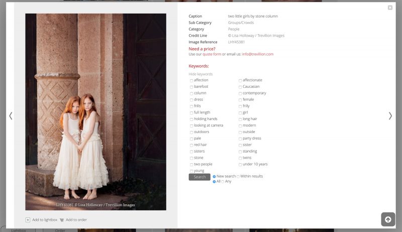
XS websites use a full page preview template by default. You can configure what appears where on the page with the configuration tools in Back office. You can also build custom preview pages and modal previews
that appear on top of search results pages, galleries et cetera. A number of page fragments can be included in your custom HTML to build the final preview page or modal dialog. The page fragments have code and conditions to automatically adapt to the user’s permissions, the type of file that’s showing, certain Back office settings and so on.
Recommended reading
- XS customisation
- Using custom CSS
- Preventing problems caused by CSS
- Working with the Infradox script library
- Using Javascript in your pages
Important
Certain Infradox tags and/or include files can be used in specific templates only. Adding tags to – or including page fragments in – templates where they can’t be used can wreck havoc on your website. Read the recommended articles before you begin. We can not offer support if you do not follow the instructions that are available in our knowledge-base articles.
Changes for Flex
The tags that use include files use the flex subfolders ‘previewflex’ and ‘previewcflex’, you will have to use e.g.
as opposed to
Flex Script
To reduce the footprint of the Infradox script library, script functions must be added in the code editor to script file ‘previews script’ (id 86) if you want to use certain functions in your preview pages. This allows for more advanced customisation and it improves efficiency by including only script for functions that your website actually uses. Examples of script you’ll need to add are for functions among which ‘buy print’, ‘get quote’, ‘price agreements’, ‘multi RF’ and social functions such as comments, likes, social media sharing etc.
The modal dialog preview
You can create both a modal preview dialog and you can create a custom full screen preview page. If you want previews to display using a modal dialog (as opposed to displaying a separate page), you can do so by enabling the “Preview Modal HTML” template in the Code editor. Note that the normal preview page (either the standard version or your own custom version) will still be available, this is the page that search engines / site crawlers will see – which is important for SEO.
You can also use the modal preview for certain page types/functions, and the normal full screen preview page for other functions. If you want to do this then go to Site configuration > Preview page > Modal preview dialogs, and select the page types where you want to use the modal preview dialog.
To use the default template as a starting point, go to the code editor, select “Preview modal” in the template dropdown. Click the Load examples button and select the first template in the list. Click the Use code button in the dialog.
Tags
- previewH1
This tag outputs the field that you have configured in back office as the field to use for the preview title as H1. Note that this is important for search engines.
Example of use: - previewwidth Outputs the width of the preview image.
- previewheight Outputs the height of the preview image.
- restrictionsterritories Outputs the names of territories for which territorial restrictions exist.
- partofgalleries Outputs links to galleries of which the file is part (see paragraph below)
The media tag can also be used on preview pages to output a value for a media data property:
- rf Outputs 1 if the file is RF or else 0
- rm Outputs 1 if the file is RM or else 0
- bi Outputs 1 if immediate download is blocked
- br Outputs 1 if the file has blocking restrictions
- nb Outputs 1 if the file has restrictions that don’t result in blocking
- tr Outputs 1 if the file has territorial restrictions
- mr Outputs 1 if the file has a model release
- pr Outputs 1 if the file has a property release
- hr Outputs 1 if the file is marked as high res
- ed Outputs 1 if the file is marked as editorial, 0 for commercial
- ba Outputs 1 if the file is blocked for agents
- bx Outputs 1 if the file is blocked for API’s
- ns Outputs 1 if the file is blocked for syndication
- ps Outputs 1 if the file is available for print sales
You can use the above, e.g. to output class names for elements in your HTML.
Similar images
You can display similar images on your preview pages (modal and standard). Images are marked as similar based on keyword commonality, i.e. if an image scores a certain percentage when keywords are being analysed. This process takes place when a new file is added to the database, or when you save a file’s metadata. Note that your data may have to be reprocessed if you want to start using this function.
To display a number of thumbnails of similar images, add the following to your template:
You can style the container and the HTML that’s generated by the <?xs media(‘similars’,9,0) ?> tag. It outputs divs with class name “thumbnail” and links with class name “similarthumb”. The thumbnails are output as background images for the links. The number 9 in this example is used to list a maximum of 9 thumbnails. You can change this number as required. The second parameter (0 in this example) selects the template to use. Currently this parameter must be 0.
Part of galleries
If you use the tag then make sure to create a container with the id previewgalleries and add the tag in a container with the id previewgallerieslist. This is because the Infradox script library checks how many child items the tag generates, and if none – then the container is automatically hidden. So if the file is not part of any galleries then all info will be hidden.
Have a look at this example HTML snippet:
Datafields and Datafield tag
You can output all the datafields (as you have configured in the metadata repository) with a single tag:
This will output the HTML for all fields that are configured to display in the metadata repository. The resulting HTML applies classes and properties to automatically display values as links, to hide labels if a field is blank and so on – based on what’s configured in the repository.
If however, you want more control – then you can use the datafield tag instead. This is described below.
Outputting the complete field HTML
Important: if you want to output data for fields using the below tags, then make sure that the fields are configured to be displayed on client facing pages in the metadata repository. To do this, open the metadata repository in back office and click on the “Previews” button in the toolbar. Then make sure that the fields that you want to use are listed in the box on the left.
Use the ‘c’ parameter to output the complete HTML with an outer container div, a div for the label and a div for the field’s data. The output HTML uses the repository settings to apply properties, e.g. show only if the user is an admin, show as link, hide outer container if the field’s value is blank – and so on.
For example:
Which may output:
The class names (as showing in the above example) are fieldcontainer, fieldname and fieldvalue. If you want to use different class names, then you must supply all three class names as tag parameters. For example:
The Style attribute color is applied if you have configured this in the metadata repository (e.g. <div class=”fieldvalue” style=”color:red”>).
Outputing the field label only
Use the ‘l’ parameter to output the field’s label only (as configured in the repository and based on the active locale). E.g.:
Outputting the field’s value only
Use the ‘v’ parameter to output the field’s value only (as configured in the repository and based on the active locale). Example:
If you want to display just a single field in a different postion, you can still use the <?xs datafields(‘preview’) ?> tag, and then simply hide the field that you don’t want to show with css. For example, let’s say that we want all the metadata fields on the right next to the preview image, but we want the caption to show underneath the preview image.
Add this underneath the preview image:
Then add this css to hide the caption that is ouput as a result of the <?xs datafields(‘preview’) ?> tag, e..g.:
You can use the following fields:
- id
- refcode
- contentreffield
- creditnamefield
- credit
- copyright
- objectname
- headline
- byline
- caption
- creationdate
- creationtime
- author
- category
- subcategory
- captionwriter
- custom1 .. custom17
- datetime
- orgfilename
Special field tags
In addition to using the field names as explained above, there are two field names that you can use to output HTML for a field’s value.
- contentreffield
outputs the file id according to what you have configured in Back office - creditnamefield
outputs the credit based on your Back office configuration (which can be a macro)
For example:
Page fragments
There are several page fragments that you can include in your preview templates. XS uses these page fragments so that you can use the same code in both the normal and the modal preview templates and so that you can easily output the HTML where you want it to appear on your page. Page fragments are also used for more efficient pre-parsing and caching, to hide complex implementation details (i.e. what’s in the HTML based on settings, user permissions, content type and so on) – and to make it easier to update your website to another version. Some of the page fragments however, can be changed if there’s a need to do this – which is described further down in this article.
Important Flex websites use page fragments in the subfolders ‘previewflex’ and ‘previewcflex’. You’ll need to change the include tags accordingly. For example, use ‘previewflex\metadata.inc’ instead of ‘preview\metadata.inc’.
metadata.inc
Including this file will output all html and data regarding rights and restrictions. This is the recommended way to embed this information in your custom preview templates, but you can use your own html too (the code editor provides various examples).
media.inc
This page fragment outputs the preview image, video (or other file type). The HTML is automatically parsed to out output the correct HTML depedning on the media type, user permissions and so on.
Example:
thumbnailscroller.inc
This outputs the html for the thumbnail scroller that is used to paginate when viewing full screen previews, you cannot use this in the code for the modal previews. The appearance of the scroller is configured in backoffice Site configuration > Preview page > Pagination. You can then embed the scroller in a div with class name tspaginationbar and add the attribute scrollersetting with a value between 0 and 5. This attribute represents the setting as configured in backoffice. E.g. 0 for Fixed size, five thumbnails, 1 for Dynamic size, five thumbnails et cetera.
buttonbar.inc
Outputs the html with the links for add to/remove from cart, add to/remove from lightbox, download comping image, and send by e-mail. The HTML is automatically parsed to get the final output based on the user’s permissions, file restrictions, the page the user is on, backoffice settings et cetera. For example on the preview page of a lightbox image, the button “Remove from lightbox” will show and the button “Add to lightbox” will not. This include file uses the settings that you have configured in backoffice, i.e. whether or not you want labels to display, which button set to use and so on.
If you want to be able to customize/change the HTML that this template produces, then you can create the ‘preview button bar’ template (160) in the code editor. And you can then use the template ‘buttonbarcustom.inc’ in your preview templates instead, as below (template 160 is explained in detail further down in this article):
shopbuttons.inc
The shopbuttons.inc template outputs the HTML for the download, quote, and buy print buttons based on the user’s permissions and backoffice settings. Note that the behavior of the buttons and whether or not the buttons appear, also depends on permissions and backoffice settings. If you want to be able to change/customize the html that this template produces, then you can use template 161 in the code editor. And you can then use the template ‘shopbuttonscustom.inc’ in your preview templates instead. Template 161 is explained in detail further down in this article.
Combining shopbuttons.inc and buttonbar.inc
For Flex 32.11 and later: If you want to have all the buttons in a single bar, then you can use the page fragment ‘buttonbar-allbuttons.inc’ instead of the files that are explained above. Example:
Note that if you use the above tag, you’ll have to remove the tags for buttonbar and shopbuttons.
facebookbuttons.inc
previewtext.inc
This outputs the text for the active media (image, video or other) that you have configured in backoffice.
keywords{number}.inc
You can include 3 different page fragments for keywords. keywords0 outputs the HTML for the draggable keywords, keywords1 outputs the HTML for keywords with checkboxes, and keywords2 outputs a simple list of clickable keywords. Use either
The above page fragments output the complete HTML for the keywords functions. In version 32.11 or later, you can also output just the keyword list items so that you can change the rest of the HTML in your template.
You can use the tags below (note that you need to use ‘previewcflex’, not ‘previewc’):
You can use the above fragments for example like this:
In version 31 or later, you can add parameters when you include any of the available keywords templates. By default, this tag uses the fields and settings that you have configured in backoffice. If you want to override these settings, then you can use the parameter “fields” to specify the field or fields that you want to use. And you can use the parameter “separator” to specify how the words in your fields are separated. Below are a few examples:
The fields parameter takes a value between apostrophes. You can add as many fields as you want but the value of the fields must be separated with the same separator. E.g. commas, spaces, dashes et cetera.
The separator parameter takes a value between apostrophes, e.g. ‘space’. You can use only one of the following values: comma, semicolon, dash, space.
You can use this to display different keywords depending on e.g. the active subdomain or the active locale/UI language. For example:
With Flex 32.11 or later you can configure localised keywords which will automatically select the configured keyword field for the active UI. You can read more about this in the article: How to configure localised keywords.
filesizes.inc
Outputs the file sizes table HTML which is automatically parsed to display the correct details based on the user’s permissions, site configuration settings and so on.
Conditions
If you have protected galleries, then make sure to use the condition gallerylocked. Example of use:
To include HTML only if a specific locale is active – you can use e.g.
To include HTML regarding the user’s discount and maximum downloads, you can use e.g.
Below are some more conditions that you may need (the list is not complete, contact us if you need other conditions):
CSS
You can use <style></style> for CSS but it best to move your css to the separate custom CSS editor when you are done developing the custom pages. However, if for example you want to apply a fixed with to an element that is based on the width of the preview image, then you can use e.g.
or inline
Javascript Before and After methods
When the preview HTML loads and the related Javascript will be executed, a call to
is made and after the Infradox script has completed execution, a call to
is made.
Both calls receive the parameter modal to indicate whether the preview HTML was loaded in a modal dialog or as a normal HTML page.
You can define these methods in your client Javascript object (which you’ll find in the code editor’s template drop down), for example:
Important: Do not include script in the preview templates, add your script to the client.js template as described above!
Customising the ‘buttonbar’ template
The buttonbar.inc page fragment outputs the add to/remove from cart, add to/remove from lightbox, download comp and send by e-mail buttons. It takes backoffice settings and user permissions into account. The code is a separate template (page fragment) so that you can include it in both the normal and the modal preview template. You can of course also add code from the page fragments directly to your template (as opposed to using the html() function), but that is not recommended. If you want more control over the HTML that is output by the buttonbar.inc page fragment (explained above) in your preview pages, then edit template 160. And when you’re done, edit the preview template and replace the tag as shown below:
Important: you may only include these page fragments in preview page templates!
Note that the code uses classes on which the XS script library depends (i.e. those classes are not just there for styling purposes). Although not all classes are essential for the XS script library, it is recommended that you don’t remove any of the original classes. You can of course add your own classes to the HTML and you can override the styling properties with CSS. For example:
Below is the code that you can load into the editor for a custom button bar template, read the comments in the template for instructions / notes. You must remove the comments from your code or those lines (starting with //) will be in your HTML.
Below is a version of template 160 that was changed as follows:
We don’t want labels next to our buttons, we want a comping image button only if the user is logged in, we always want the e-mail button:
Customising the ‘shopbuttons’ template
The shopbuttons.inc page fragment outputs the download, quote, and buy print buttons. It takes backoffice settings and user permissions into account. If you want more control over the HTML that is output by the shopbuttons.inc page fragment (explained above) in your preview pages, then edit template 161. And when you’re done, edit the preview template and replace the tag as shown below:
Important: you may only include these page fragments in preview page templates!
You can load the starting template into the code editor with the “Load example” button. It has instructions on lines starting with //. You must remove those lines from the template.


