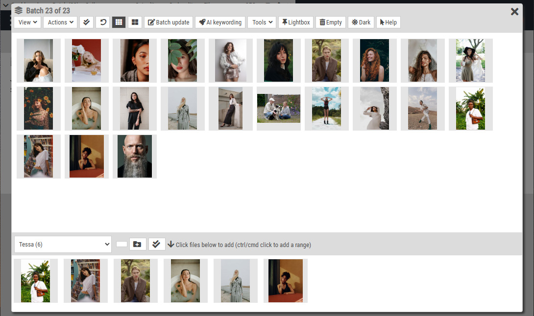
This article describes how you can customize the check boxes and radio buttons
Introduction
In version 31.2 all HTML for the client facing pages uses labels for radio buttons and check boxes, and all such inputs have a unique id. Clicking on a label has the same effect as clicking on the actual check box or radio button which makes it easier for users to use such inputs. Especially on mobile devices. Furthermore this approach offers more flexibility for customizing the HTML with CSS and script.
Recommended reading
Changing the appearance of radio buttons and check boxes with CSS
You can easily change how the inputs look by adding CSS in the code editor. We have added example CSS that uses Font Awesome to the code editor examples. The file name is checkboxes-radiobuttons-fontawesome.txt. You can change the icons that are used to replace the inputs by changing the codes that you’ll see in the CSS content properties.
E.g. “\f111” which is the code for an “unchecked” radio button icon, and “\f192” which is the code for a “checked” radio button icon. You can find other icons on the Font Awesome website.
First make sure that you have enabled Font Awesome, then load the example CSS into the code editor and save your changes. Below is the example CSS:
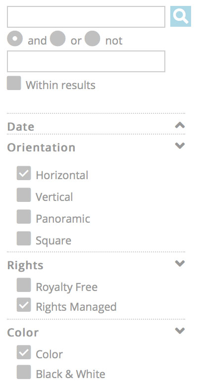
The above CSS will make the radio buttons and check boxes look like what you see in the screen shot below. You can of course change the size, color and so on.
To use “solid” or “closed” looking icons as shown in the screen shot below, simply change the font-weight from 300 to 600.
Note that you can use a different icon to indicate disabled inputs, and that you can e.g. use a different color for selected and/or disabled inputs, for example: